The phrase ‘Housing Crisis’ is everywhere. In most media and public discussion, it revolves around the most prevalent symptom, namely that average house prices are high and disadvantage those who don’t own them. The main victims of this being young first-time buyers and those on lower incomes.
This is no doubt an important manifestation of the housing crisis, but it is not a particularly useful definition when analysing the housing market throughout history. ‘Reasoning from a price change’ only gets you so far. Simply put, there are a large number of reasons why the average house could be more expensive over time, with many of them not representing a ‘crisis’ that leaves any individual worse off.
For example, the average house price could be more expensive because people are buying larger and higher quality housing. Even though the price of a given house may not change, the average recorded price of houses being bought will still be higher. This could be because as peoples incomes increase, they are simply able to spend more on housing. Equally, this can also occur if the cost of credit falls and consumers can borrow more and increase their housing expenditures that way.
However, this is not the whole picture. If it were, there would be no ‘Housing Crisis’. The complaint is not that housing per se is more expensive, but that housing for every given property is more expensive. People aren’t buying an asset worth on average eight times the median household income to live in palaces, but instead to live in a building that sixty or so years ago would be worth two times the median household income. This is also shown by international comparisons. In the early 1960s, Britain had the cheapest housing in Europe. However, now it is on average the smallest and most expensive relative to income.
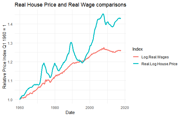
The pattern over the long run is shown here. Even if we make the extremely optimistic assumption that people increase their housing expenditure proportional to their income growth, then it is still clear that there has been a long-running trend in recent British history for a given house to become less affordable:

However, to be able to interpret this graph fully, several issues will need to be covered over the course of this blog:
Firstly, although the price of houses is recorded, this is actually a misleading notion of the price of housing. Houses are not apples, people very rarely pay for a house outright. What actually matters is the cost of housing, which is represented by the rent of the house or individual mortgage payments, once differences in tax between these types of payments have been factored in.
Secondly, as mentioned before, there is the question of quality. For example, one aspect of this would be the average size of the houses people are buying and the quantity of the frontage being allocated.
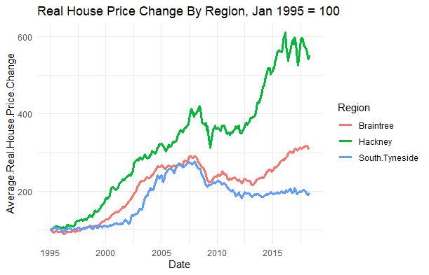
Thirdly, there is the question of regional differences. Britain has only ever had major simultaneous national house price increases in all regions during the 1970s. Since then, they have been mostly concentrated in the South East and particularly London. Sadly, there is only readily available data from 1995 onwards. ( In a later post I will extend the timeline, but that will involve a trip to the British Library. ) However, the pattern of recent divergence is clear enough.
This can be seen in the underlying graph which shows three sub-markets. These are Hackney in East London, Braintree in Essex and South Tyneside:
Note that not only have prices in London grown far quicker than in other areas, but it is also worth noting/highlighting that houses in many parts of the North are less valuable than they were before the financial crash.
Once the previous three points have been addressed, only then can we answer the question at the centre of the housing crisis, which is ‘how much have people been paying per month for a given property in a given place over time ?’
The overall pattern which I will argue in this substack is that Britain’s housing crisis began earlier than is usually thought. It begins with an unsuitable policy combination of subsidised demand and restricted supply which began in the 1960s and continues, in modified form, to this day.
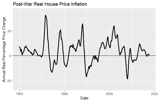
However, the impact of housing policies is rarely straightforward. As can be seen in the pattern of price increases from 1960, the market has been characterised by extreme volatility and frequent crises. In both 1974-5 and 2008-2009, the British financial system was pushed to the brink of collapse by house price crashes.
Over the course of these articles, I will attempt to explain what happened and why. This will cover both the realities of the situation and later historical myths, examining both the very real socialist and free-market implementation of housing policy. I also hope to show how housing is intertwined with modern British history. After all, in our lives, the homes and neighbourhoods in which we live are rarely insignificant.


